Harini Ran
UI/UX Designer + 2D Animator
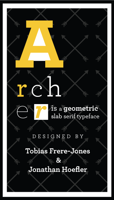
ARCHER
Two informative animations about one of Jonathan Hoefler's popular fonts, Archer. The first animation is advertising the upcoming event in NGV and the other being informative animation about his typeface.
INTRODUCTION
> THE BRIEF
The brief required to create two motion graphics project of a pre-selected typographer. One displayed in streets to as an announcement for the upcoming NGV and the other being a short bio of the typographer displayed inside the gallery.
> THE RESPONSE
Jonathan Hoefler was the pre-selected typographer. I chose the font, Archer from his creations, not only it's one of his popular fonts, the structure was of the typeface was unique, and trying to incorporate the obvious (the arrows) with the letter A was fun.
RESEARCH
> ABOUT JONATHAN HOEFLER & ARCHER
Jonathan Hoefler is an American typeface designer, also the founder of Hoefler&Co. His lifelong love for typography has led him to design some of the most memorable typefaces such as Archer. Archer is a geometric slab serif typeface designed by Jonathan Hoefler and Tobias Frere-Jones in 2001. Originally created for Martha Stewart: Living Maganize. Archer is a combination of two basic styles: Geometrics and Antiques. They restored all the ‘ball terminals’ to the lowercase, and applied these gestures to the capitals as well - to express a font that friendly but not silly. Archer also comes in eight weights which offers a delightful contrast, from hairline to heavyweights.
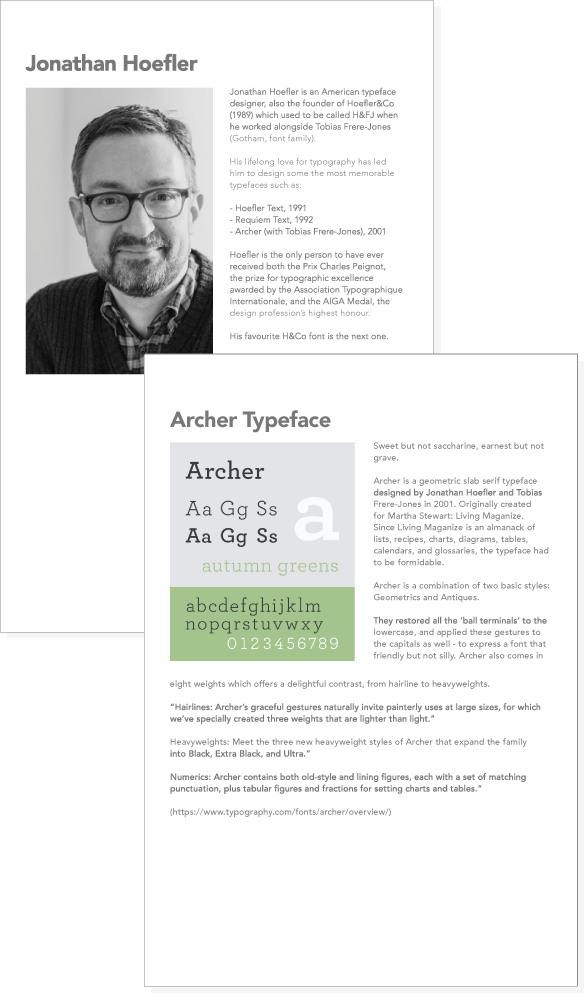
Jonathan Hoefler is an American typeface designer, also the founder of Hoefler&Co. His lifelong love for typography has led him to design some of the most memorable typefaces such as Archer. Archer is a geometric slab serif typeface designed by Jonathan Hoefler and Tobias Frere-Jones in 2001. Originally created for Martha Stewart: Living Maganize. Archer is a combination of two basic styles: Geometrics and Antiques. They restored all the ‘ball terminals’ to the lowercase, and applied these gestures to the capitals as well - to express a font that friendly but not silly. Archer also comes in eight weights which offers a delightful contrast, from hairline to heavyweights.
Jonathan Hoefler is an American typeface designer, also the founder of Hoefler&Co. His lifelong love for typography has led him to design some of the most memorable typefaces such as Archer. Archer is a geometric slab serif typeface designed by Jonathan Hoefler and Tobias Frere-Jones in 2001. Originally created for Martha Stewart: Living Maganize. Archer is a combination of two basic styles: Geometrics and Antiques. They restored all the ‘ball terminals’ to the lowercase, and applied these gestures to the capitals as well - to express a font that friendly but not silly. Archer also comes in eight weights which offers a delightful contrast, from hairline to heavyweights.
> REFINING THE STORYBOARD
I wasn’t very happy with my designs which is why I worked on the refinement process first before creating my storyboard and animating. The feedback was very helpful in reaching the final outlook of the mobster.
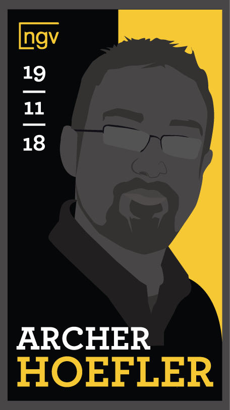
Styleframe One
Suggestions: More information was required, such as location and time
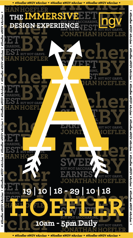
Styleframe Two
Suggestions: Too overcrowded with text, not enough spacing.
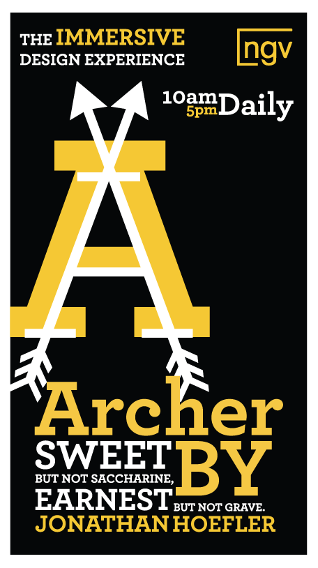
Styleframe Three
Suggestions: The information above has no grid structure
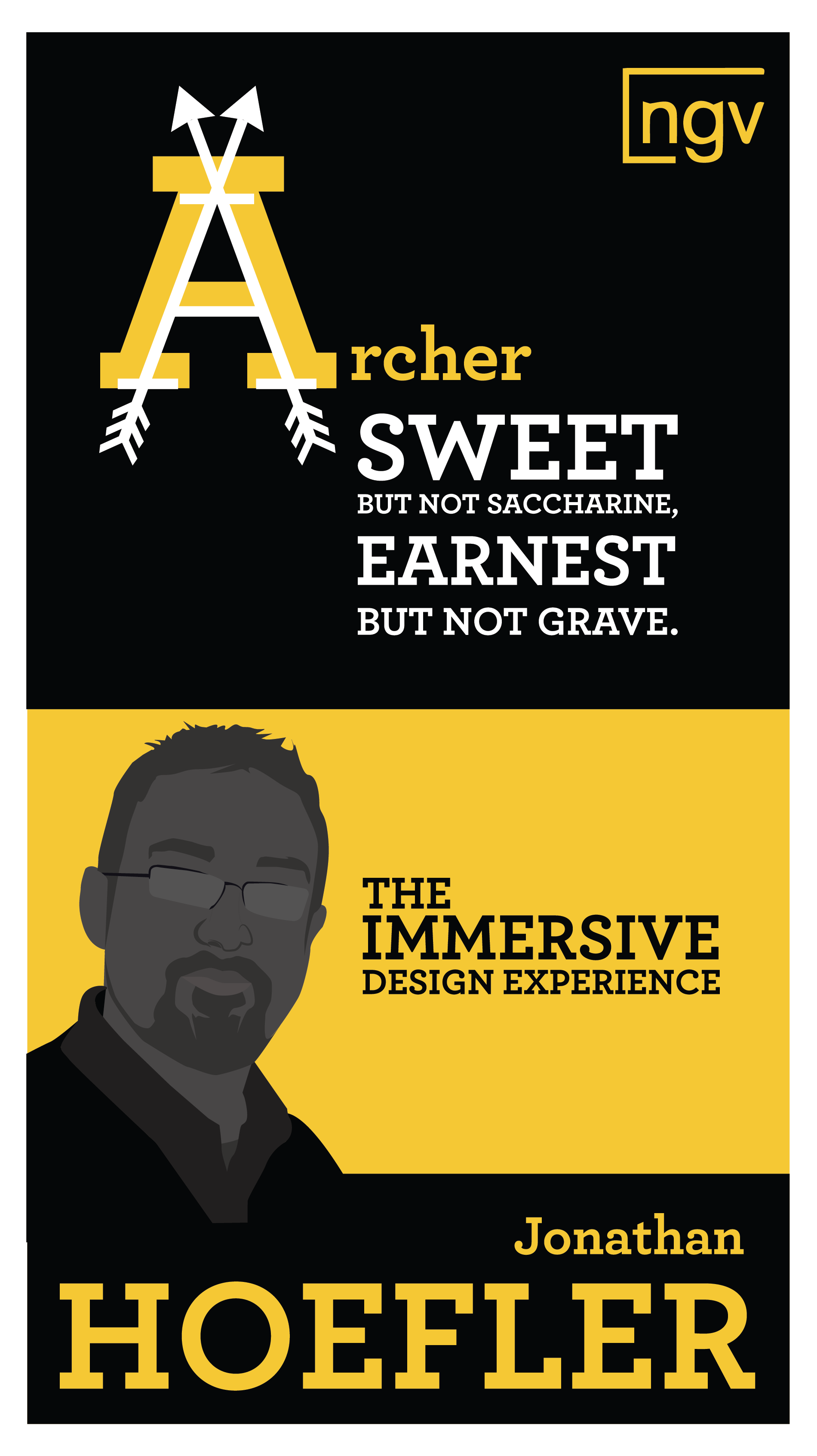
Styleframe Four
Suggestions: You didn’t include the dates of the exhibition
Styleframe Five
Suggestions: Remove the background, reposition the the date and time
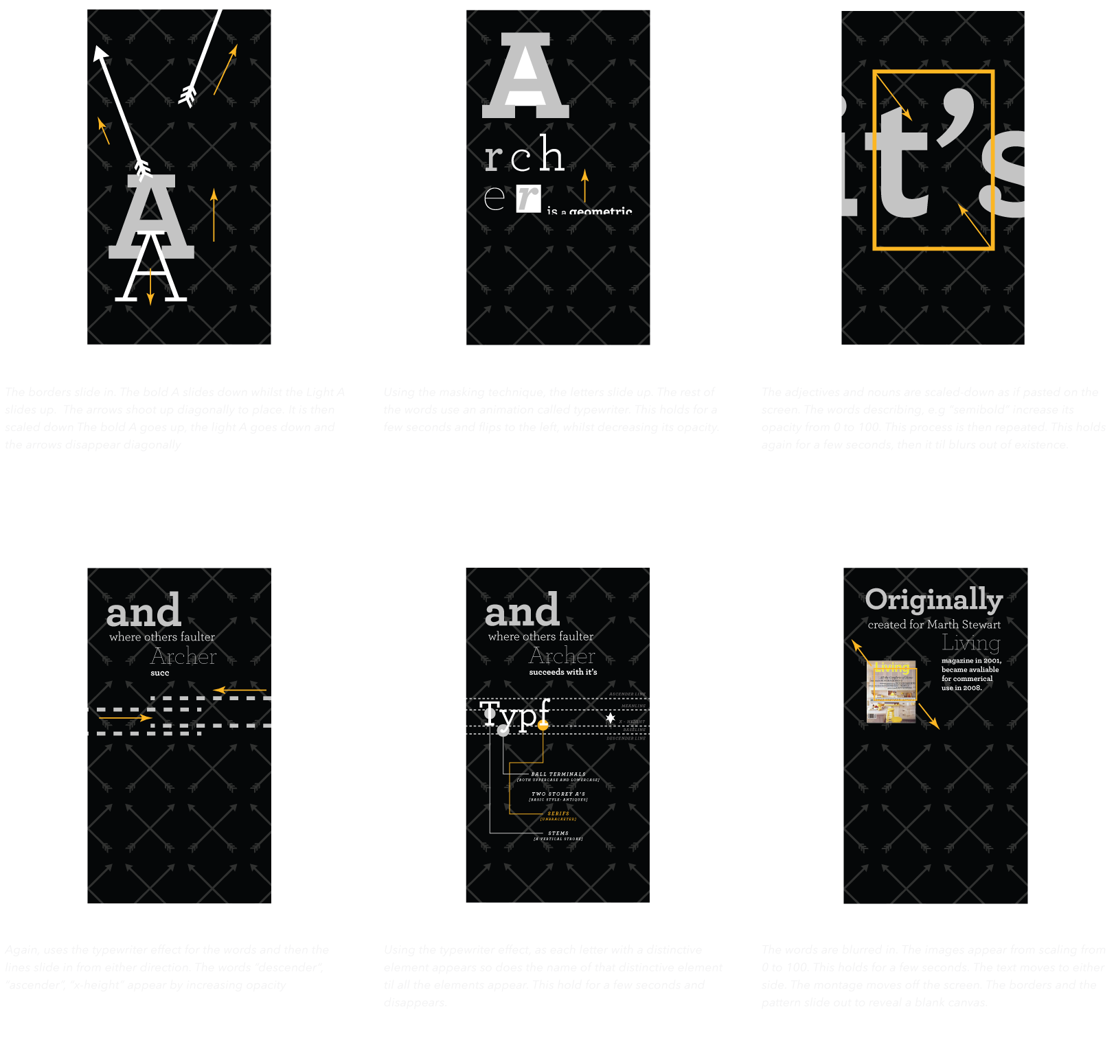
STORYBOARD
This is the storyboard for the mobster and the description of the animation in frames, the italics represent how the illustrations will move in sequence.
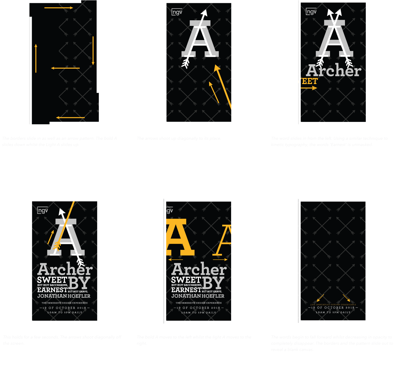
This is the storyboard for the mobster and the description of the animation in frames, the italics represent how the illustrations will move in sequence.
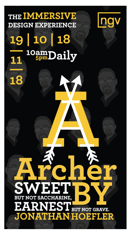
DESIGNS
The final animation was built using illustrator and after effects. The screen resolution here is HD, 1080 x 1920